VISUAL DESIGN
To create our final designs we had to firstly develop a visual system to bring consistency to our work. After creating our first version we presented our stills to our peers and iterated based on their critique.
Design Language
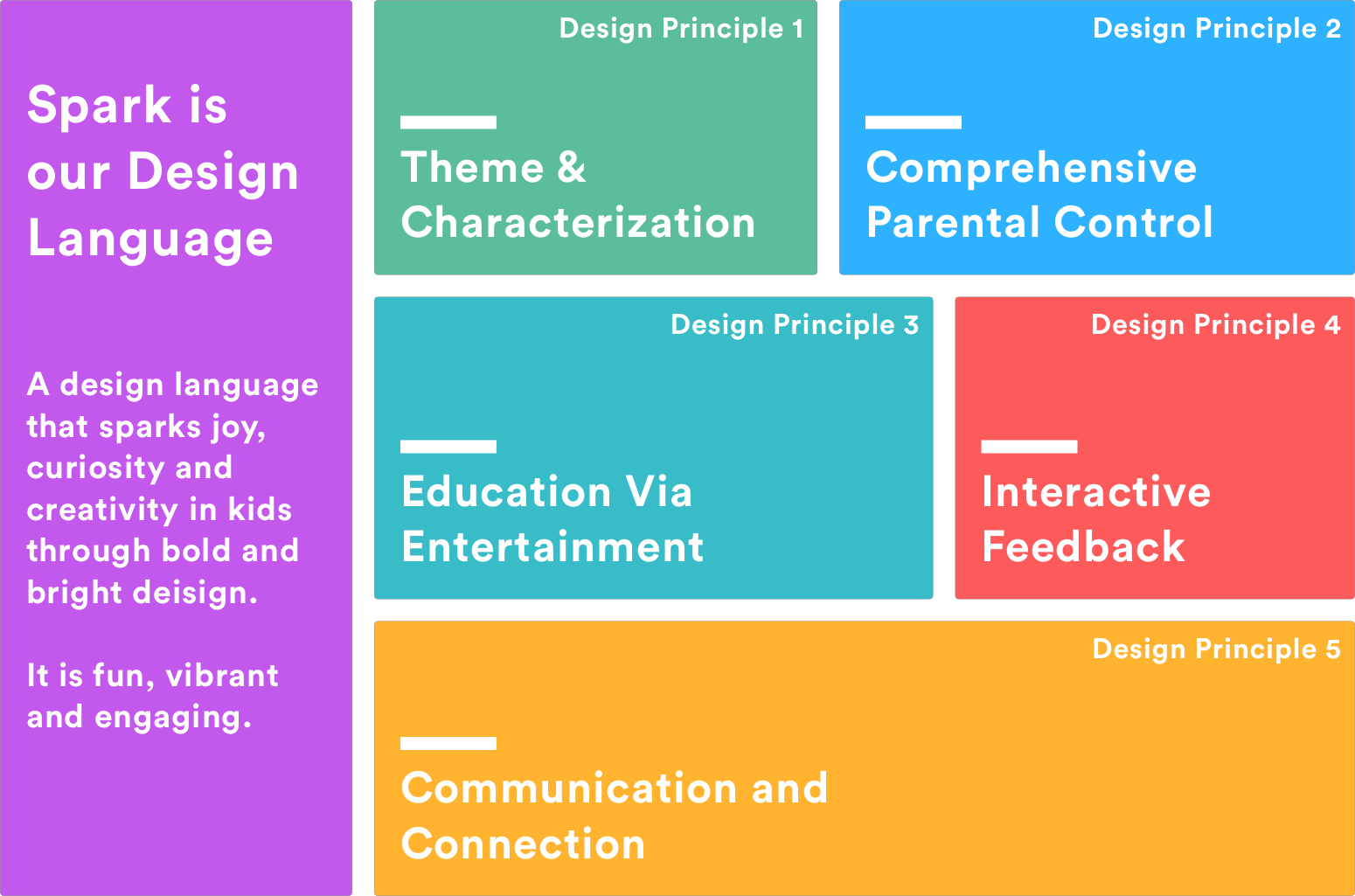
We created Spark our design language. We wanted to visually represent our research and design requirements. We believed that it would help focus us and bring uniformity to all our designs.
First Iteration
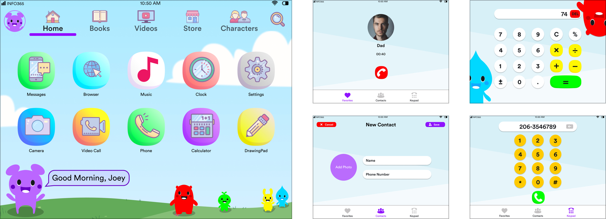
We started developing various applications that would be part of the native Spring OS system. Every 2 weeks from here on we ideated, conceptualized and designed the main screen(s) of 5 new applications. During this time our project took an interesting pivot in terms of our visual design.
Initially our design was heavily rooted in android as the Amazon Kindle Fire (Kids Edition) was the most popular kids tablet on the market. It felt overcrowded along with instances of us not utilizing screen real estate properly. This caused an inconsistency in the overall feel of the product. We hence went back to the drawing board to rethink our design strategy.
Takeaways
Overcrowded
Home screen, Books, Videos and other high level functions looked over crowded
Under-Utilizing screen real estate
Application such as Dialer, contacts, phone, calculator, clock seemed vacant and empty
Gestures
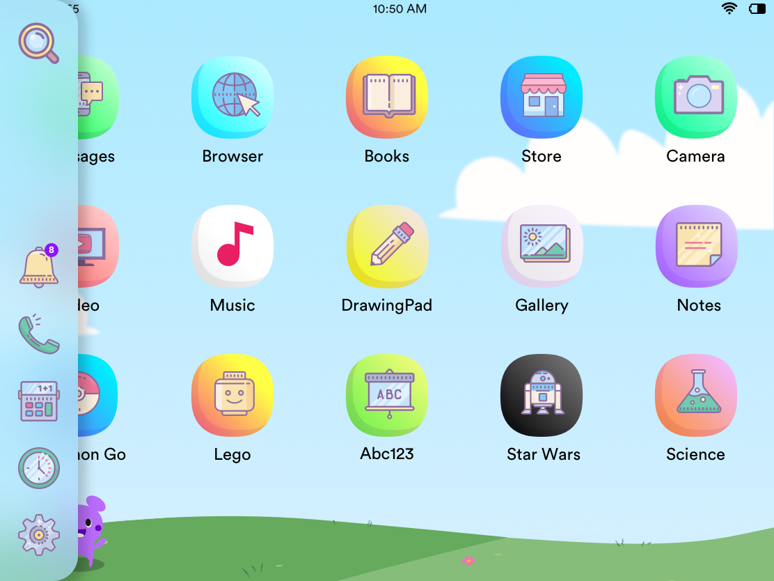
We developed a series of additional gestures based on feedback. We created a floating vertical nav bar that could launch 'smaller' application or utilities in separate windows due to limited functionality of those apps.

Launching the Navigation Bar

Launching a utility application
from the Nav Bar
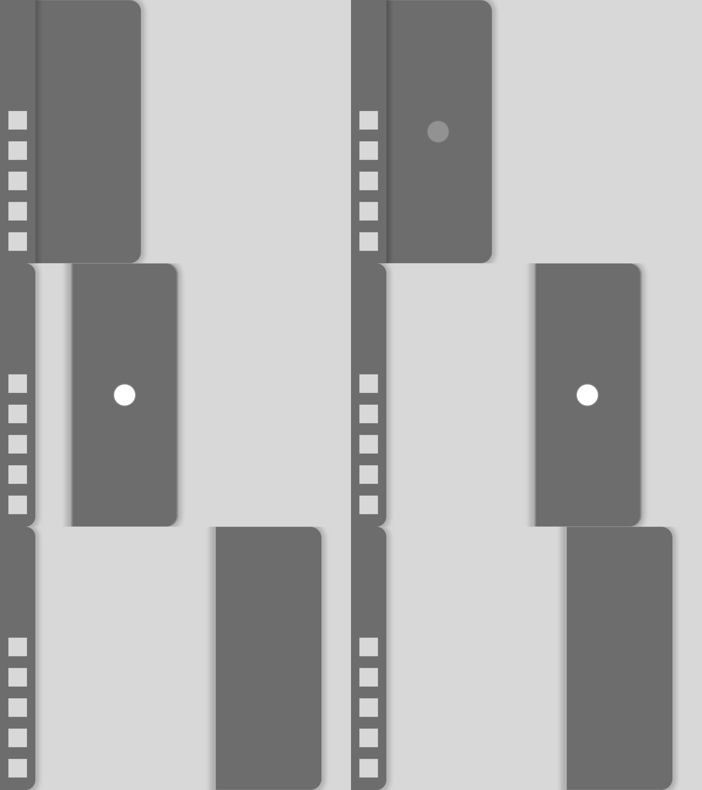
Dragging the app to be its
separate window
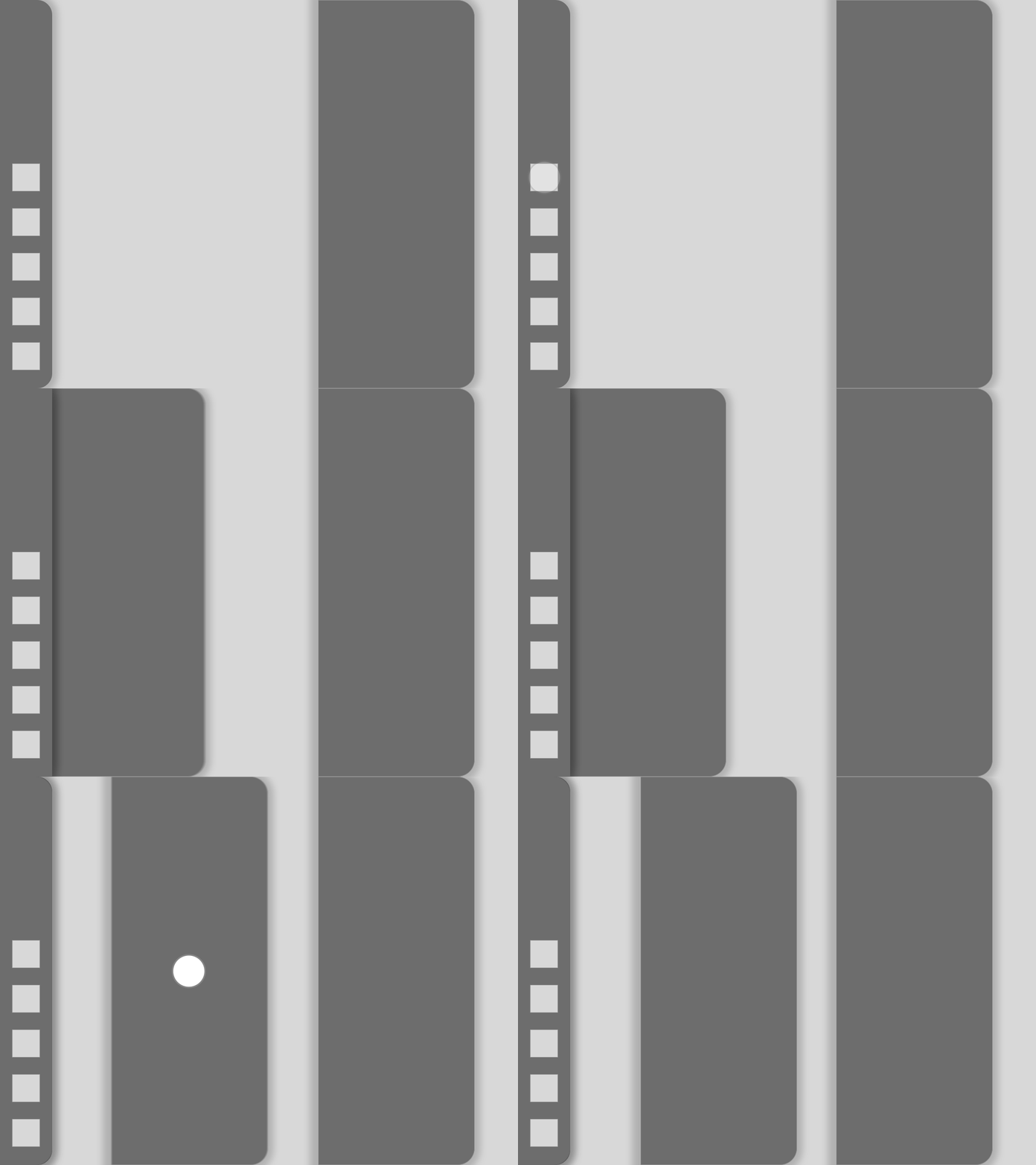
Launching a secondary application
from the Nav Bar
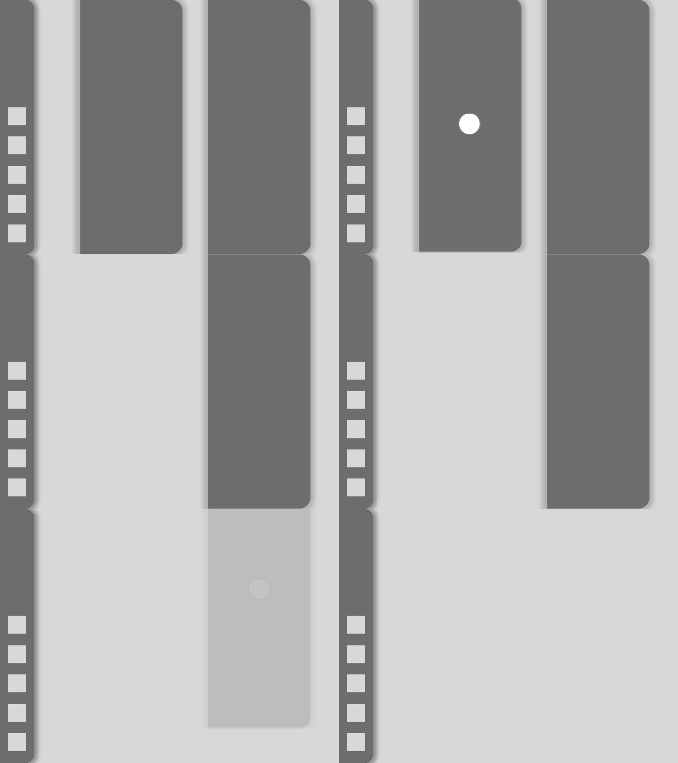
Exiting a launched application

Pulling out the secondary addition
to the Nav Bar
Modifications
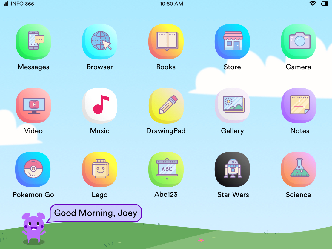
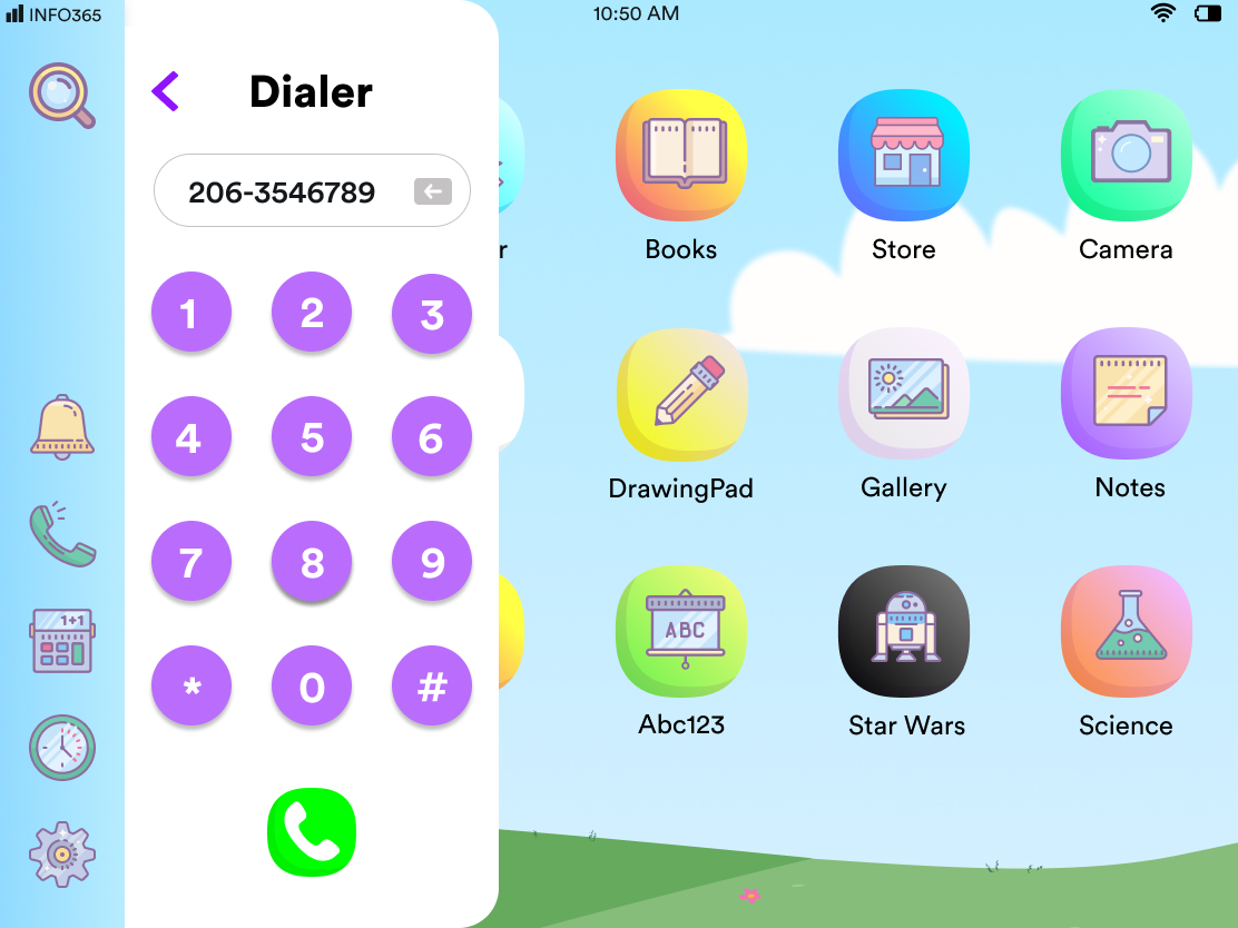
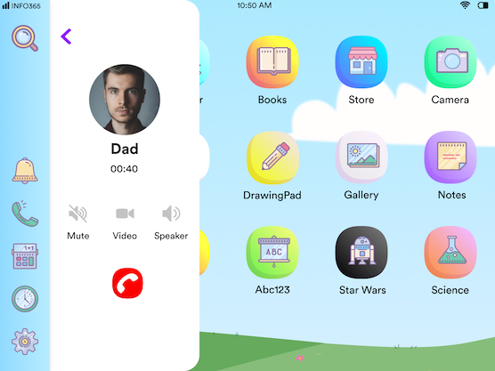
After developing the system our users would now use to interact with the device, we started segregating application into Small screen and Full screen application. Settings, Phone, Contacts, Clock, Stopwatch and Calculator would now be a part of these small screen application. We also re designed the home screen as well as created the high fidelity navigation bar.
Home Page
Feedback
The page seemed clustered and repetitive. The floating nav bar on top of the apps didn't work. The icons on the home screen were much larger making the page seem overpacked with information.
Design Recommendation
Replaced the top Nav Bar with a swipe in Navigation from the Left
Changed Icon spacing and grid structure
.png)
Older User Interface

New User Interface
Updated User Interactions

User swipes from Left side of screen to reveal navigation

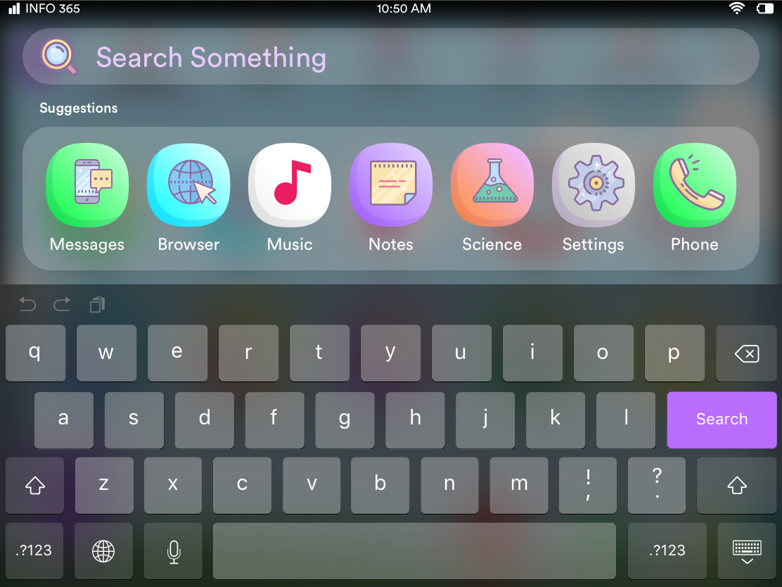
User Swipes down from the top of the screen to Search
Small Screen Apps
Feedback
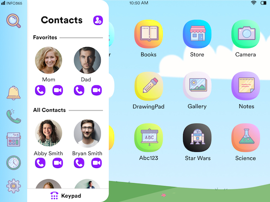
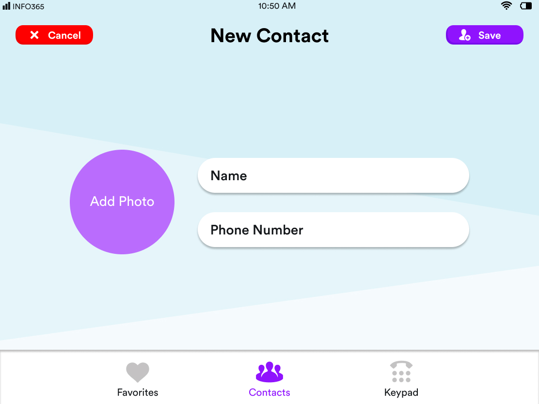
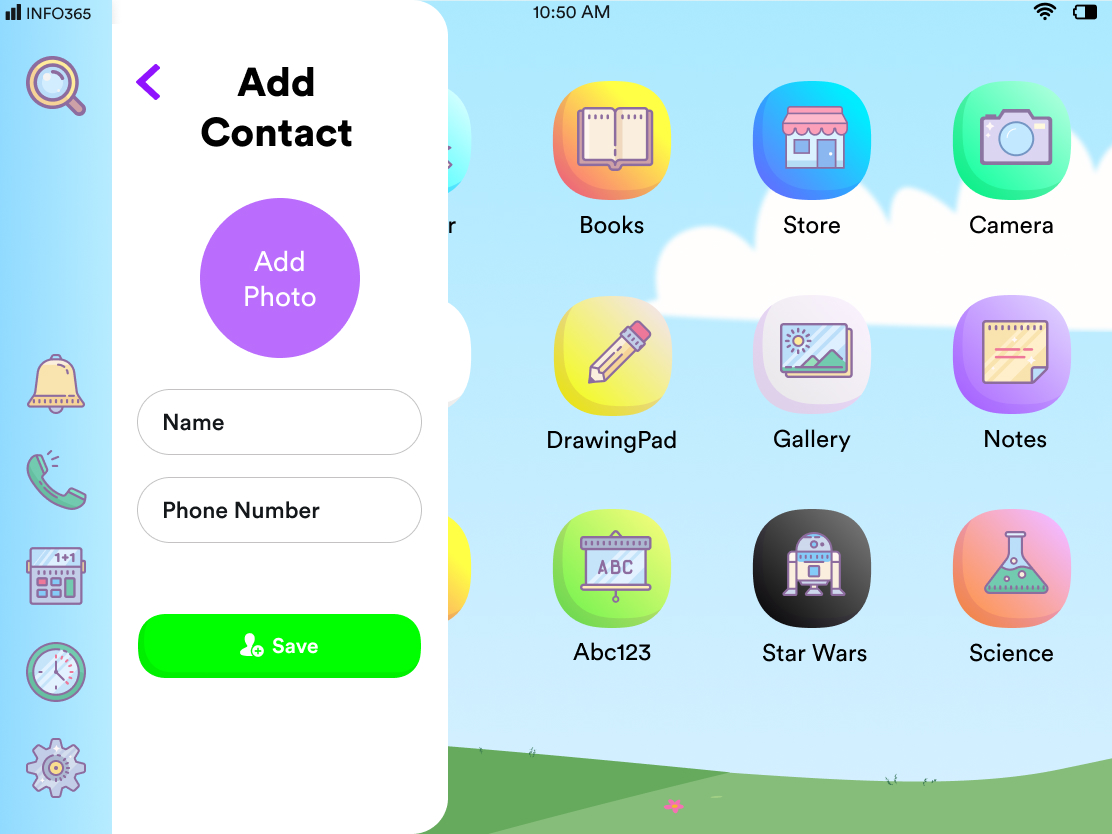
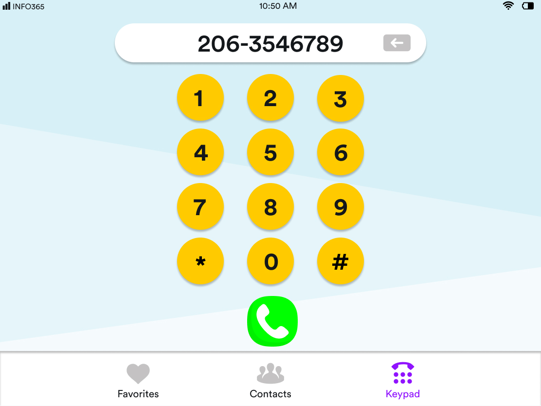
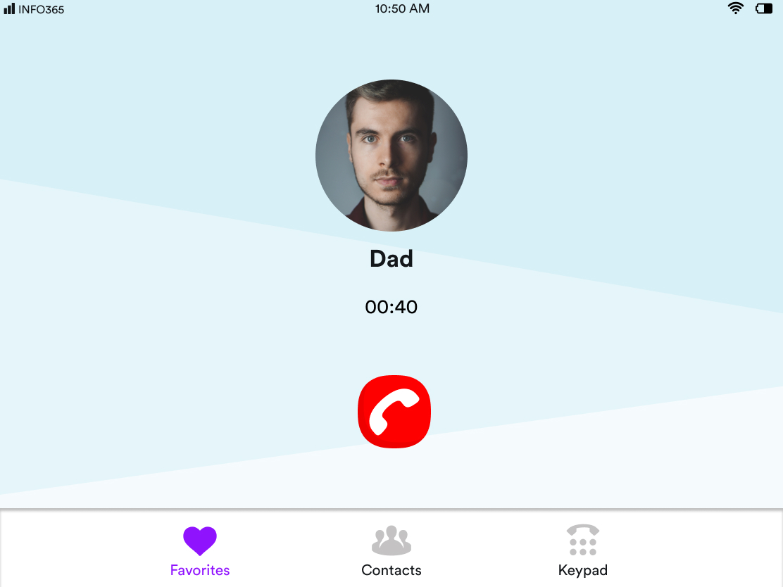
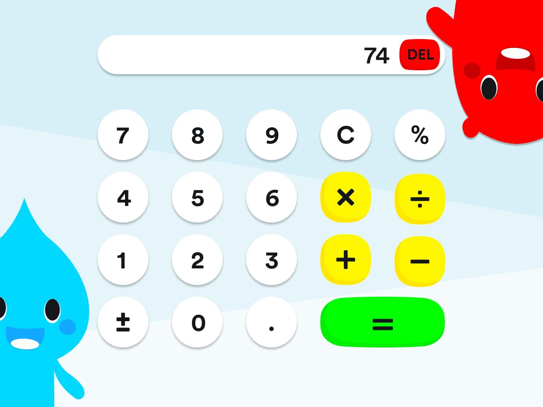
Certain applications that we had built seemed to take up too much screen space. The application felt empty as there wasn't a lot of information being present on them.
Design Recommendation
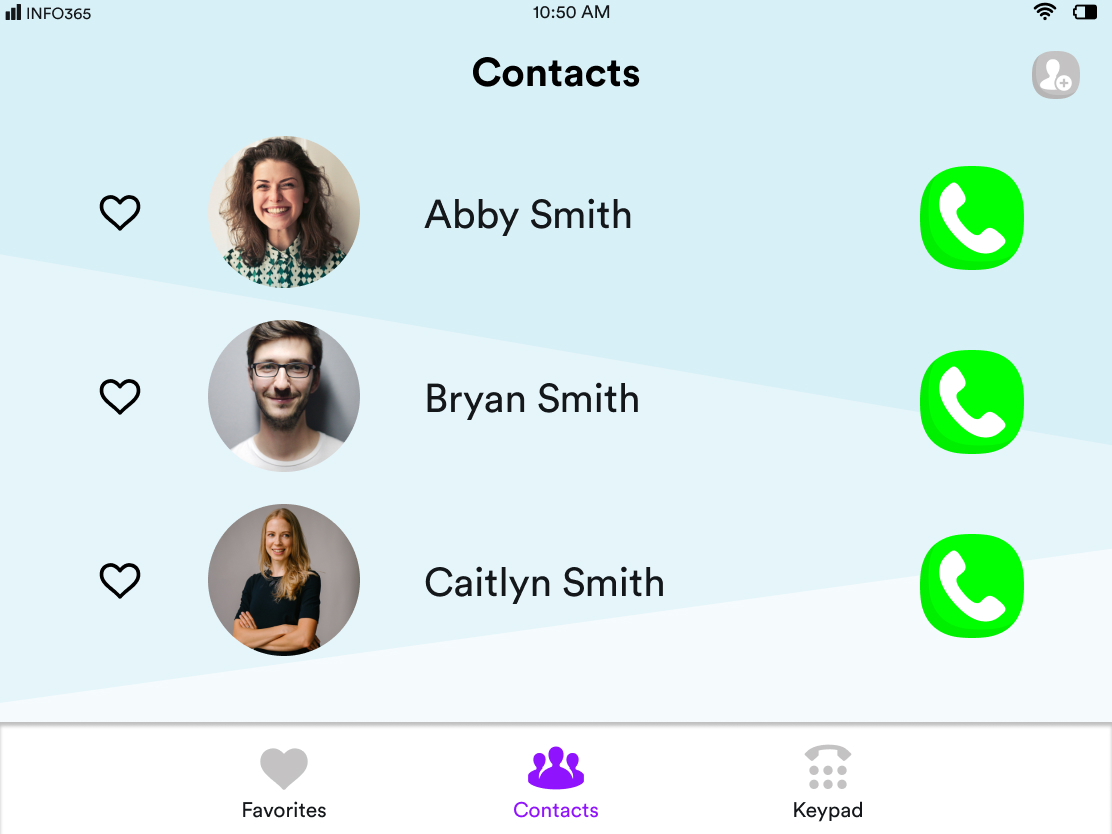
Redesigned these applications to be "small Screen" Application that can be launched from the nav bar and interacted with using our new gestures.
Contacts

Older User Interface

New User Interface
Add New Contact

Older User Interface

New User Interface
Dialer

Older User Interface

New User Interface
Calling

Older User Interface

New User Interface
Calculator

Older User Interface

New User Interface
Final Designs
We made our final designs for the operating system. Personally I worked on the Home Page, Navigation Bar, Search, External Parental Controls app, Settings and the Phone app.


-1657.png)
-1644.png)
-1677.png)


.png)
